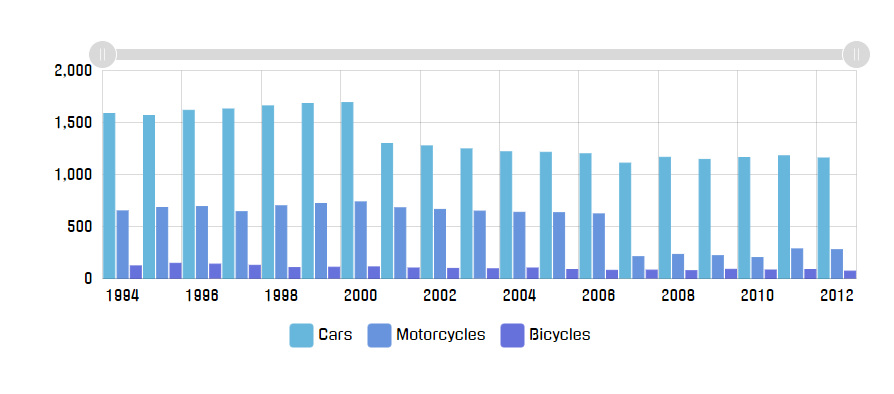
Imagine your everyday regularly-boring normal chart like this:
Looks good at full size - 900 pixels wide.
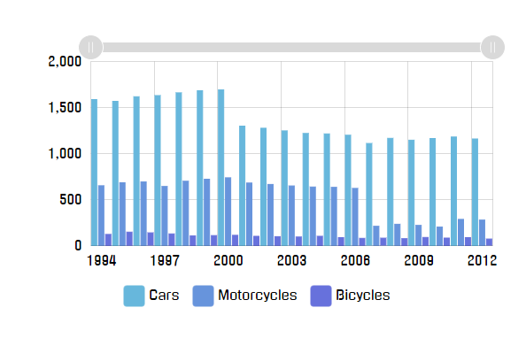
Now, let’s imagine we’ll need to cram it into less space, like 600 pixels:
Columns are kinda crammed together, but the chart is still passable.
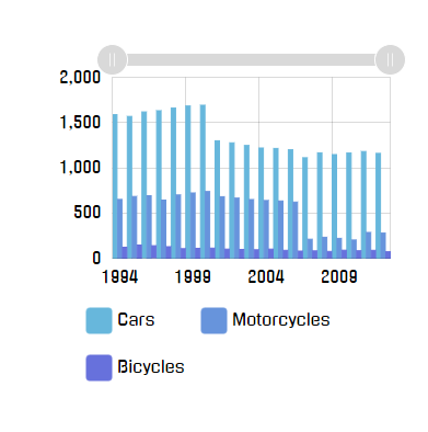
Let’s go deeper: 400px.
The chart is now bordering of hardly comprehensible. Suddenly we are aware of wasted white space around the chart, and the legend that takes up whopping third of the available area.
Deeper? Alright: 200px.
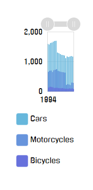
OK, this is getting ridiculous, but let’s try to go even deeper: 100px.
Congratulations! We now have a completely useless chart on our hands.
You may argue, that nobody in their right mind would make chart container that small, and you might be right.
However, we’re living in a multi-platform world, where the designer of a website is not in complete control anymore. The web page that looks perfectly fine on desktop, might crumble down like in the above examples when viewed on a phone, that uses much lesser resolution.
Responsive features in amCharts 4 allow overriding and dynamically changing certain settings or features of the chart based on the actual available space.
For example, we could have made our chart look better if we got rid of padding and legend when space is scarce. Axis labels could go inside plot area, further saving us space.
This dynamic transformation is controlled using Responsive Rules. We’re just going to call them “Rules” from now on.
A Rule is basically an object that does two things:
Checks if current chart parameters matches certain conditions, i.e. “chart’s actual width is less than 400 pixels”;
Generates a “State” object which has to be applied if the Rule is relevant.
This allows us to create chart once, and make it automatically adapt to various conditions.
chart.responsive object has a property rules which is a list of Rules. A Rule is an object that corresponds to the IResponsiveRule interface, which means it has to have at least two methods:
relevant(target) - it is called so the rule can do its own calculations to determine whether it is relevant for the current situation;
state(target, stateId) - it is called when Responsive asks the Rule to generate a State that needs to be applied to the object if the Rule is currently relevant. (as determined by relevant() call)
REQUIRED READING Responsive works by applying states to various objects of the chart. States is a concept of temporarily applying set of property values to an object. For more information, please read our “Sates” article.
chart.responsive.rules.push({ relevant: function(target) { // Code that determines if rule is currently relevant // and returns true or false return false; }, state: function(target, stateId) { // Code that creates a new SpriteState object to be // applied to target if Rule is "relevant" return; }});
chart.responsive.rules.push({ relevant: function(target) { // Code that determines if rule is currently relevant // and returns true or false return false; }, state: function(target, stateId) { // Code that creates a new SpriteState object to be // applied to target if Rule is "relevant" return; }});
{ // ... "responsive": { "enabled": true, "rules": [{ relevant: function(target) { // Code that determines if rule is currently relevant // and returns true or false return false; }, state: function(target, stateId) { // Code that creates a new SpriteState object to be // applied to target if Rule is "relevant" return; } }] }}
Right now, the Rule above, does nothing. Let’s try tackling issues with our chart above, one by one.
Instead of specifying pixel values and defining functions, you can use built-in pre-defined breakpoints, accessible via am4core.ResponsiveBreakpoints static class.
You can use its static pixel values:
Accessible via
Value
am4core.ResponsiveBreakpoints.XXS
100
am4core.ResponsiveBreakpoints.XS
200
am4core.ResponsiveBreakpoints.S
300
am4core.ResponsiveBreakpoints.M
400
am4core.ResponsiveBreakpoints.L
600
am4core.ResponsiveBreakpoints.XL
800
am4core.ResponsiveBreakpoints.XXL
1000
Or via “relevant”-compatible functions:
Accessible via
Check
am4core.ResponsiveBreakpoints.widthXXS
width <= 100
am4core.ResponsiveBreakpoints.widthXS
width <= 200
am4core.ResponsiveBreakpoints.widthS
width <= 300
am4core.ResponsiveBreakpoints.widthM
width <= 400
am4core.ResponsiveBreakpoints.widthL
width <= 600
am4core.ResponsiveBreakpoints.widthXL
width <= 800
am4core.ResponsiveBreakpoints.widthXXL
width <= 1000
am4core.ResponsiveBreakpoints.heightXXS
height <= 100
am4core.ResponsiveBreakpoints.heightXS
height <= 200
am4core.ResponsiveBreakpoints.heightS
height <= 300
am4core.ResponsiveBreakpoints.heightM
height <= 400
am4core.ResponsiveBreakpoints.heightL
height <= 600
am4core.ResponsiveBreakpoints.heightXL
height <= 800
am4core.ResponsiveBreakpoints.heightXXL
height <= 1000
am4core.ResponsiveBreakpoints.maybeXXS
width <= 100 || height <= 100
am4core.ResponsiveBreakpoints.maybeXS
width <= 200 || height <= 200
am4core.ResponsiveBreakpoints.maybeS
width <= 300 || height <= 300
am4core.ResponsiveBreakpoints.maybeM
width <= 400 || height <= 400
am4core.ResponsiveBreakpoints.maybeL
width <= 600 || height <= 600
am4core.ResponsiveBreakpoints.maybeXL
width <= 800 || height <= 800
am4core.ResponsiveBreakpoints.maybeXXL
width <= 1000 || height <= 1000
am4core.ResponsiveBreakpoints.isXXS
width <= 100 && height <= 100
am4core.ResponsiveBreakpoints.isXS
width <= 200 && height <= 200
am4core.ResponsiveBreakpoints.isS
width <= 300 && height <= 300
am4core.ResponsiveBreakpoints.isM
width <= 400 && height <= 400
am4core.ResponsiveBreakpoints.isL
width <= 600 && height <= 600
am4core.ResponsiveBreakpoints.isXL
width <= 800 && height <= 800
am4core.ResponsiveBreakpoints.isXXL
width <= 1000 && height <= 1000
The “relevant” function we had before can be simplified using breakpoints:
Since our chart IS 400px or less, responsive will try to call Rule’s state() method expecting to receive a SpriteState object which it can then apply to chart.
For starters, let’s try to shave off margins, that are way to generous at this size:
You can have more than one rule. The chart will check each rule if it’s relevant() and will apply it as it is, in the same order as you have rules set.
Let’s say we have three rules set:
The first rule checks whether chart width is 400 pixels or less;
The second rule checks whether the chart width is 300 pixels or less;
The third rule checks if the width is 200 pixels or less.
And, we have a chart that is currently 300 pixels wide. What will happen is this:
The first rule will be applied;
The second rule will be applied;
The third rule will not be applied.
This allows for very powerful combinations and setups to be created with rules overriding all or some of the settings set by other rules, and so on.