This quick tutorial will serve as an introduction to the special type of series - CurvedColumnSeries.
Just so we’re in a familiar territory, let’s start with a basic column chart.
It has one Column series, with an adapter coloring each column a new color.
* --------------------------------------------------------
* This demo was created using amCharts V4 preview release.
* V4 is the latest installement in amCharts data viz
* library family, to be released in the first half of
* For more information and documentation visit:
* https://www.amcharts.com/docs/v4/
* --------------------------------------------------------
am4core . useTheme ( am4themes_animated );
let chart = am4core . create ( " chartdiv " , am4charts . XYChart );
let categoryAxis = chart . xAxes . push ( new am4charts . CategoryAxis ());
categoryAxis . renderer . grid . template . location = 0 ;
categoryAxis . dataFields . category = " country " ;
categoryAxis . renderer . minGridDistance = 60 ;
let valueAxis = chart . yAxes . push ( new am4charts . ValueAxis ());
let series = chart . series . push ( new am4charts . ColumnSeries ());
series . dataFields . categoryX = " country " ;
series . dataFields . valueY = " value " ;
series . columns . template . strokeWidth = 0 ;
series . tooltipText = " {valueY.value} " ;
chart . cursor = new am4charts . XYCursor ();
// Add distinctive colors for each column using adapter
series . columns . template . adapter . add ( " fill " , ( fill , target ) => {
return chart . colors . getIndex ( target . dataItem . index );
< div id = " chartdiv " ></ div >
-apple-system , BlinkMacSystemFont, " Segoe UI " , Roboto, Helvetica , Arial , sans-serif ,
" Apple Color Emoji " , " Segoe UI Emoji " , " Segoe UI Symbol " ;
Column chart with alternating colors column-chart-with-alternating-colorsYour just everyday normal column chart.
ColumnSeries to CurvedColumnSeries:
let series = chart . series . push ( new am4charts . CurvedColumnSeries ());
var series = chart . series . push ( new am4charts . CurvedColumnSeries ());
" type " : " CurvedColumnSeries " ,
Let’s see what we have now:
* --------------------------------------------------------
* This demo was created using amCharts V4 preview release.
* V4 is the latest installement in amCharts data viz
* library family, to be released in the first half of
* For more information and documentation visit:
* https://www.amcharts.com/docs/v4/
* --------------------------------------------------------
am4core . useTheme ( am4themes_animated );
let chart = am4core . create ( " chartdiv " , am4charts . XYChart );
let categoryAxis = chart . xAxes . push ( new am4charts . CategoryAxis ());
categoryAxis . renderer . grid . template . location = 0 ;
categoryAxis . dataFields . category = " country " ;
categoryAxis . renderer . minGridDistance = 40 ;
let valueAxis = chart . yAxes . push ( new am4charts . ValueAxis ());
let series = chart . series . push ( new am4charts . CurvedColumnSeries ());
series . dataFields . categoryX = " country " ;
series . dataFields . valueY = " value " ;
series . tooltipText = " {valueY.value} " ;
series . columns . template . strokeOpacity = 0 ;
chart . cursor = new am4charts . XYCursor ();
// Add distinctive colors for each column using adapter
series . columns . template . adapter . add ( " fill " , ( fill , target ) => {
return chart . colors . getIndex ( target . dataItem . index );
< div id = " chartdiv " ></ div >
-apple-system , BlinkMacSystemFont, " Segoe UI " , Roboto, Helvetica , Arial , sans-serif ,
" Apple Color Emoji " , " Segoe UI Emoji " , " Segoe UI Symbol " ;
Curved column series curved-column-seriesNice, huh?
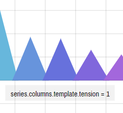
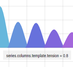
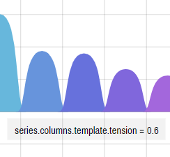
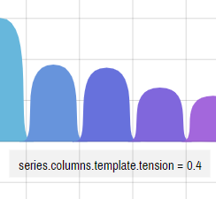
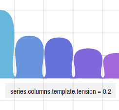
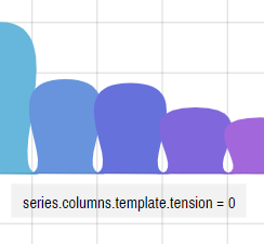
tension setting.
A tension is a setting which indicates how strong anchor points attract the line to it. The values can range from 0 (totally lose) and 1 (maximum force).
A setting of 1 (one) will attract the line to it, resulting in perfectly straight lines and pointy columns.
Below is n example how different tension settings affect the actual series appearance: